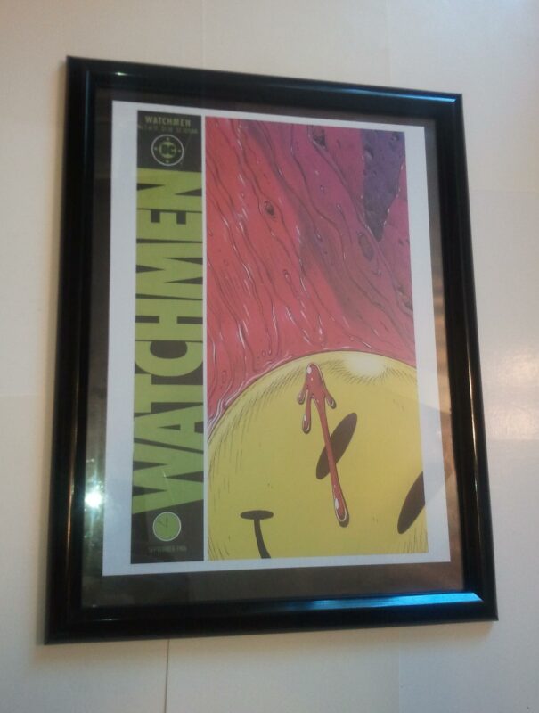
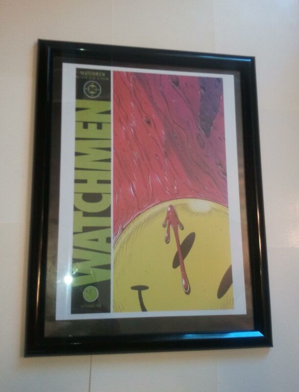


Watchmen Poster #1 FRAMED Watchmen # 1 Cover (1986) Dave Gibbons
$74.99
Description
You are purchasing the item pictured, framed. Priority mail, tracking and $50 insurance is included with purchase. Item will be bagged to protect from dust, packed in packing peanuts and boxed. Just open box and hang it on the wall…makes a perfect gift!
When Watchmen # 1 hit the direct sales racks in the summer of 1986, it not only jolted DC sales and set the world of super-hero comicc on its ear. It also reintroduced a venerable feel-good logo-the smiley face- to pop cultural prominence. Initially popularized in the 1960s by Harvey R. Ball, a graphic designer working for the State Mutual Life Assurance Company of America, the grinning day-glo icon quickly became grist for parody in the hands of the nation’s comic book artists. In 1972, MAD magazine published a smiley cover with Alfred E. Neuman at its center. DC’s own Prez, a short-lived series about America’s “first teen president,” had given the face a sinister twist in the form of Boss Smiley, a corrupt politician with a big yellow smiley face for a head. But it was Dave Gibbons who hit upon the brainstorm of spattering the worldwide symbol for “Have a Nice Day” with an artfully placed dallop of “five to midnight” blood. The powerful image prefigured both the violent end of the Comedian – and the climactic apocalypse to come. “The Comedian was one of the characters we wrestled with. We tried to make him look sort of military. Then the idea came: Let’s make him dark with black leather. I drew a sketch like that and I said it looked good, but it didn’t say Comedian…so I said: I know, I’ll just give him one of those yellow smiley badges, that’ll be a nice little play against all that blackness. So I stuck that on his chest and when Alan saw that, he realized that that was the perfect way to symbolize the Comedian being killed: to show this badge covered in blood. From there, it developed into the iconic trademark of the whole series. Things evolved in that kind of organic way.” – Dave Gibbons. Watchmen is a graphic novel by writer Alan Moore, artist Dave Gibbons, and colorist John Higgins. It was serialized as a limited series by DC Comics in 1986 and 1987, and collected in 1987. Watchmen originated from a story proposal Moore submitted to DC featuring superhero characters that the company had acquired from Charlton Comics. As Moore’s proposed story would have left many of the characters unusable for future stories, managing editor Dick Giordano convinced Moore to create original characters instead. Moore used the story as a means to reflect contemporary anxieties and to critique the superhero concept. Watchmen depicts an alternate history where superheroes emerged in the 1940s and 1960s, helping the United States to win the Vietnam War. The country is edging towards a nuclear war with the Soviet Union, freelance costumed vigilantes have been outlawed and most former superheroes are in retirement or working for the government. The story focuses on the personal development and struggles of the protagonists as an investigation into the murder of a government sponsored superhero pulls them out of retirement, and eventually leads them to confront a plot that would stave off nuclear war by killing millions of people. Creatively, the focus of Watchmen is on its structure. Gibbons used a nine-panel grid layout throughout the series and added recurring symbols such as a blood-stained smiley face. All but the last issue feature supplemental fictional documents that add to the series’ backstory, and the narrative is intertwined with that of another story, a fictional pirate comic titled Tales of the Black Freighter, which one of the characters reads. Structured as a nonlinear narrative, the story skips through space, time and plot. A commercial success, Watchmen has received critical acclaim both in the comics and mainstream press, and is frequently considered by several critics and reviewers as comics’ greatest series and graphic novel. After a number of attempts to adapt the series into a feature film, director Zack Snyder’s Watchmen was released in 2009. A video game series, Watchmen: The End is Nigh, was released in the same year to coincide with the film’s release. In 2012, DC Comics began publishing Before Watchmen, a comic book series acting as a prequel to the original Watchmen series, without Moore and Gibbons’ involvement. “I suppose I was just thinking, ‘That’d be a good way to start a comic book: have a famous super-hero found dead.’ As the mystery unraveled, we would be led deeper and deeper into the real heart of this super-hero’s world, and show a reality that was very different to the general public image of the super-hero.”Alan Moore on the basis for Watchmen. Dave Gibbons (born 14 April 1949) is an English comic book artist, writer and sometime letterer. He is best known for his collaborations with writer Alan Moore, which include the miniseries Watchmen and the Superman story “For the Man Who Has Everything”. He also was an artist for the UK anthology 2000 AD, for which he contributed a large body of work from its first issue in 1977. He is best known in the US for collaborating with Alan Moore on the 12-issue limited series Watchmen, now one of the best-selling graphic novels of all time, and the only one to feature on Time’s “Top 100 Novels” list. Gibbons’ artwork in Watchmen is notable both for its stark utilisation of the formulaic comicbook nine-panel grid layout, as well as for its intense narrative and symbolic density (with some symbolic background elements suggested by Moore, others by Gibbons). Initially pitched by Moore to utilize the Charlton Comics characters which had been purchased by DC Comics, Watchmen was re-tooled to feature new – analog – characters when it became clear that the story would have significant and lasting ramifications on its main players. Gibbons believes that his own involvement likely came about after the idea was already in its early initial stages. He recalls that he had: “… known Alan for a while and we had tried to get things off the ground with DC and hadn’t really succeeded. Then Alan finally broke into DC with Swamp Thing and I guess I must have heard on the grapevine that he was doing a treatment for a new miniseries. I rang Alan up, saying I’d like to be involved with what he was doing. He said ‘Oh, yeah great’ and sent me the outline for it. Then I was at a convention in the US and asked Dick Giordano, Managing Director of DC at the time, point blank whether I could draw this thing Alan was writing. He said ‘How does Alan feel about that?’ I said ‘Yeah he’s fine with it’ and Dick said ‘Yep, OK, it’s yours!’” To complement the story, Gibbons remembers working on rough character designs (which ultimately changed little in their final appearance) from “the descriptions that Alan had provided,” trying to come up with “a classic superhero feel but be a little bit stranger … a sort of operatic look … an Egyptian kind of a look.” Gibbons also lettered Watchmen and it was his lettering style that later served as one of two reference sources used by Vincent Connare when creating the controversial font Comic Sans in 1994. Gibbons has commented that “It’s just a shame they couldn’t have used just the original font, because it’s a real mess. I think it’s a particularly ugly letter form.” Gibbons returned to Watchmen in 2008, producing the behind-the-scenes book Watching the Watchmen to tie into the release of the 2009 film. Watching the Watchmen is his take on the creation of the seminal work, and features a number of rarely seen pieces of artwork including sketches and character designs, as well as “stuff,” he says “that I just don’t know why I kept but I’m really pleased I did.” In 1987, Gibbons won a Jack Kirby Award for Best New Series for Watchmen with Alan Moore and another for Best Writer/Artist (Single or Team) for Watchmen.
>PAN>Frame is shrinkwrapped until time of purchase. Ships boxed with packing peanuts.
THE PERFECT GIFT!
Related products
-
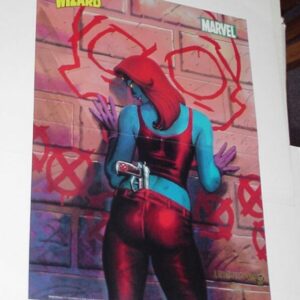
X-Men Poster #36 Mystique Joseph Michael Linsner Dawn
$34.99 Add to cart -
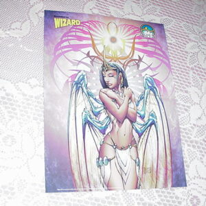
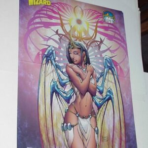
Soulfire Poster # 1 Grace by Michael Turner Fathom
$39.99 Add to cart -
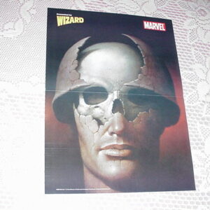
Punisher Poster # 6 by Wieslaw Walkuski Born Frank Castle Origin Movie
$29.99 Add to cart -
Aphrodite IX Poster # 2 by Trevor Hairsine Image
$29.99 Add to cart